Admittedly, we all found it hard to narrow our choices to just three or four cards to spotlight. There are so many awesome entries! Many thanks to all who played along.
We hope you enjoyed our first One-Layer Simplicity challenge and that you are looking forward to February's challenge hosted by Heather Telford.
Susan's Details

#137 Deepti went outside the box on her adorable Valentine's Day card. The flowers outside the frame are lovely, as is the hand-drawn frame itself. Also, her coloring is bold, bright, simple...simply perfect!

#111 Karin pulled off a stunning victory with this white embossing on colored, textured card stock. There are no mistakes in the embossing, no stray powder clinging where it shouldn't. That level of skill and precision is awesome.

#93 Lynn's soft and gentle sympathy card uses perfectly placed twine to ground the bird, but the "cut in half" design works perfectly to show how our lives feel cut in half and frayed by grief.

#151 Debra James made this lovely monochromatic card, adding depth and dimension to her simple flower using copics over ink. The dashed line adds movement, and the oblong shape of the card creates some wonderful white space.

#60 Nonni's shading of the blue to make the flowers' petals look dimensional is a simple yet WOW technique. I love how they pop off the card!

#95 - Valerie's use of a stencil to put a lot of bold colour on her one layered card. This is a real eyecatcher and will surely bring a smile to the recipient's face!

#131 - Cornelia's use of a masked/sponged oval to ground her image is a fantastic way to emphasize the drama of the black silhouettes. If you visit her blog, you will also see the way she CASified a sketch to eliminate layers.

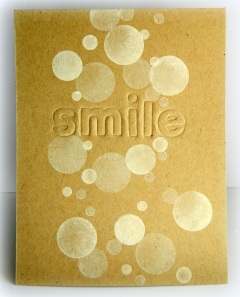
#96 - Lauren's genius idea of embossing the letters rather than die cutting and adding a layer really caught my eye - what a great way to emphasize the sentiment!
Karen's Details

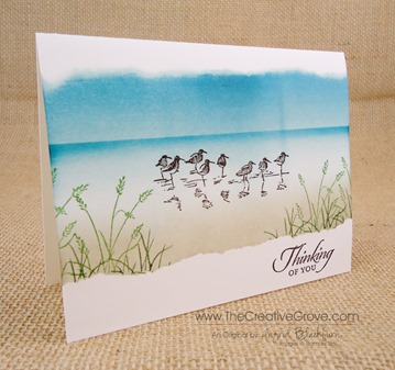
#12- Ingrid; Love the torn edges on her sponged beach scene card...makes me want a vacation.

#13- Corina; I love the collage and grunge style of her card.

#113- Sandie; The true definition of a clean, cute, fresh and fun CAS card.
Heather's Details

#20 Shery R showed how a one layer can display plenty of depth by creating shadows behind these fabulous feathers.

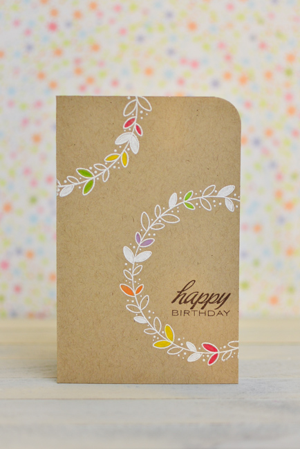
#52 May used two parts of a whole to balance this simple layout beautifully and I like the few pops of colour on the white and kraft.

#104 Toni used the basic black and white colour scheme to show off her intriguing hand drawn details.
Thanks again to each and every one of you who participated. We're off to a great start with our challenge because of YOU!!!!
