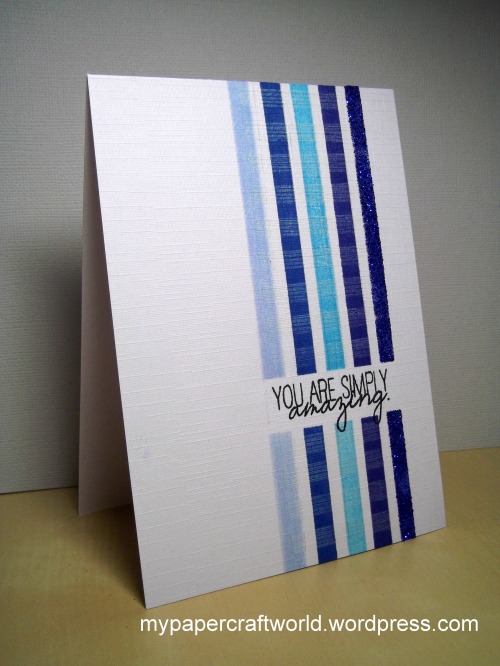
Once again it was very hard to limit ourselves to just a few details. There were so many imaginative ways to use repetition on a card.
We hope you enjoyed our February One-Layer Simplicity challenge and that you are looking forward to March's challenge hosted by Karen Dunbrook.
Heather's Details

#71 Joyce M What can I say? Tilting the dress forms was a stroke of genius; it creates movement and the overlaps add a few more tones to the lovely colours chosen.

#81 Patti shows us how to make the sentiment an integral part of a simple design.

#103 Anita's positioning of the sentiment is beautifully done. The masking and placement show her attention to detail and balance.
Karen's Details
So many wonderful cards again this month in the gallery. Here are 3 that I really liked:

#3 Toni's card was such a great example of colour variations and using a stencil over a stencil.

#10 Sue's watercolour flowers were wonderful and airy just like a watercolour picture.

#83 Mynn's hexagon card had such great detail and wonderful balance and colours.
Ardyth's Details

#85 - Lauren's choice of colours and simple shapes made this simple card stand out to me.

#79 - Gay's beautifully elegant card shows that using classic black and white is always stylish!

#90 - Karen's choice to use colour for her line images really reinforces her message.
Susan's Details

#23 Michelle W uses bling to create movement for the eye in an otherwise static graphic design

#45 Gillian R went super-clean with her design...but the chevron hearts pack an unexpected design punch

#52 Shirley-Bee used distressing so very well to soften her lovely trio of flowers
