Because one-layer cards are all about those special little details, members of the Design Team have called out cards with great details. It's always hard for us to select just a few cards for our Details posts each month...but we hope this will help people who are new to CAS or new to stamping learn about how to make these minimalist cards special!
Heather's Details

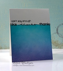
Ingrid's card is eyecatching because of that beautiful panel of blended colour. The small white space with black words provide a contrast which really stands out.

Sherrie has caught the eye with colour and with movement in the wavy extensions on the word hello.

LesLee has used a classic highlihgting technique to make an impact; use one pop of colour in the midst of an otherwise neutral colour scheme.
Karen's Details

Karin added such an elegance to her card with the embossing and the font on her stamped sentiment.

Violet's stamping sure caught my eye on this great card...well done.

Sandie did such a great job at really pulling all your interest to her sentiment with great colour!
Susan's Details

Ashwini's use of bright colors and black to make the word pop is simply awesome!

Kimberly created a coffee-themed fabulousness with a shaped word collage. Love the unity of this design.

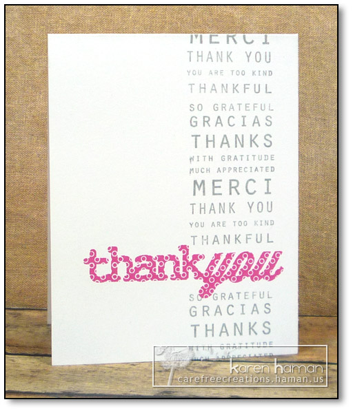
Karen used color very effectively with her hot pink focal point and gray word border. The circles on the font of the focal point also add interest to an otherwise very "straight-line" card.
Ardyth's Details

Karin's use of text on a 'brick wall' has a modern, edgy feel! Great use of texture to emphasize the message!

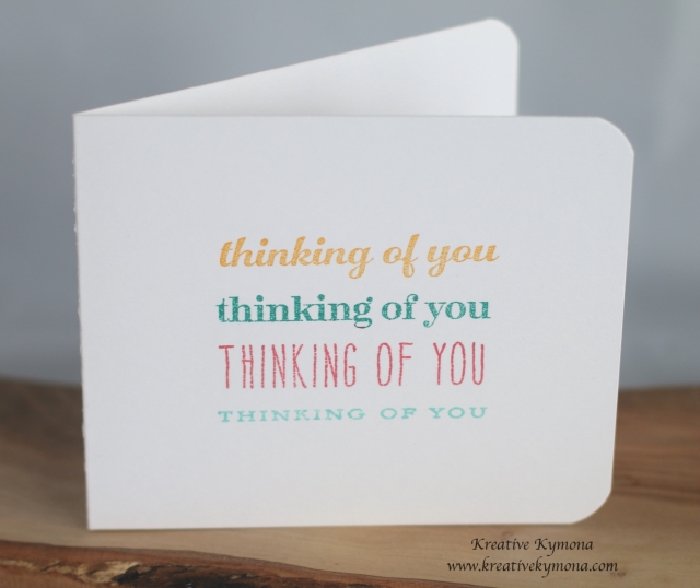
Kymona used repetition of her sentiment to ensure that the card's recipient gets the message!

I love the way Sandra created a frame for her sentiment by using simple lines.
