Sunday, March 29, 2015

OLS14 Details

What a great collection of Words, Words, Words cards! Thanks so much to all who entered the March challenge. I love how so many of you first thought it would be hard, but once you let your creativity flow, you came up with some wonderful cards! We hope you'll come back April 1st for a brand new, awesome one-layer challenge.

Because one-layer cards are all about those special little details, members of the Design Team have called out cards with great details. It's always hard for us to select just a few cards for our Details posts each month...but we hope this will help people who are new to CAS or new to stamping learn about how to make these minimalist cards special!

Heather's Details

how to use distress inks
Ingrid's card is eyecatching because of that beautiful panel of blended colour. The small white space with black words provide a contrast which really stands out.


Sherrie has caught the eye with colour and with movement in the wavy extensions on the word hello.


LesLee has used a classic highlihgting technique to make an impact; use one pop of colour in the midst of an otherwise neutral colour scheme.


Karen's Details


Karin added such an elegance to her card with the embossing and the font on her stamped sentiment.
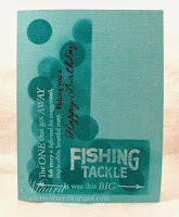


Violet's stamping sure caught my eye on this great card...well done.


Sandie did such a great job at really pulling all your interest to her sentiment with great colour!


Susan's Details


Colorful Words

Ashwini's use of bright colors and black to make the word pop is simply awesome!


Kimberly created a coffee-themed fabulousness with a shaped word collage. Love the unity of this design.

Thank You - by karen @ carefree creations

Karen used color very effectively with her hot pink focal point and gray word border. The circles on the font of the focal point also add interest to an otherwise very "straight-line" card.

Ardyth's Details


Karin's use of text on a 'brick wall' has a modern, edgy feel! Great use of texture to emphasize the message!
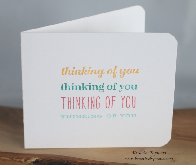
Thinking of you repeated

Kymona used repetition of her sentiment to ensure that the card's recipient gets the message!


I love the way Sandra created a frame for her sentiment by using simple lines.

Sunday, March 1, 2015

OLS14: Words, Words, Words

The March challenge is brought to you courtesy of William Shakespeare and that indecisive Danish prince Hamlet. When the pompous Polonius asks Hamlet what he's reading, Hamlet replies, "Words, words, words."

Your challenge for March is to use ONLY WORD STAMPS on your card! That means no flowers, no background stamps, no image stamps of any kind. Here's your chance to put those word stamps to good use...obscure quotations, oddly inapplicable words, your favorite words, happy words, sympathetic words, sarcastic words, whatever. As long as the stamp just prints words!

If you really want to use a lot of words all at once...make a word collage!


Now, I'm super-CAS and just put words on plain white card stock, but you should feel free to use any sort of technique to create backgrounds for your word stamps...as long as those techniques don't require actual stamps. For instance, you could ink up a bare acrylic block, spritz it with water, and create a water-color-y block background that way. You could spritz your one-layer card with any one of the variety of spray colors, you could use a brush or sponge to apply color, you could use a stencil and sponge...just NO STAMPS except word stamps.

A Friendly Reminder: This challenge is first and foremost a ONE-LAYER challenge. Please make sure your card doesn't have layers before linking it up. Thanks for observing this rule!


OLS14 Rules

1. Your card must be a single piece of card stock folded in half. No other layers allowed.

2. Use only word stamps...quotations, single words, or sentiments that have no additional images on them. You may create backgrounds for your words as long as those backgrounds don't involve image or background stamps. Remember to keep embellishments to a minimum.

3. Post your card somewhere online and link to it using the InLinkz button below. If you link to your blog, please link to the individual post and not the blog homepage.

4. The most important rule of all...HAVE FUN!


Saturday, February 28, 2015

OLS13 - Details

Thanks so much to all of you who took time to play along with our "You Blend" challenge. There are so many fabulous details to choose from that the DT has had trouble narrowing our Details post to just a few.

Susan's Picks:


Kesnija used gold spray to unite her gold-embossed sentiment and her pretty pink stenciled frame.


Maura used white embossing and three fab colors to create depth and interest on her lovely card. I also like how the black flower spills out onto the white.


Kimberly used such vivid color and white embossing to make this dramatic and pretty card. I love how the color bleeds up into the white.

Paper Learning Curve- Grá O'Neill: Clearly Besotted Stamps Brushed Poppies, Fabulous Fuchsias

Grá claims she made a mistake stamping her flowers, but she rescued it perfectly. Note the most excellent background, which she added freehand.

Ardyth's Details:


OLC Flicked Distress 001

Ingrid's bold choice of colours makes this card really pop!


Karin's stunning watercolour butterfly is a perfect example of blending!


Marianne's dramatic night sky is given real perspective by her detailed frame!

Heather's Details


It is impressive how Maura's few blended colours give the forest such depth.


Lee Ann has created a dramatic image by placing contrasting colours side by side with a thin but bold black line to divide them.


Claire's beautifully blended and layered circles almost look as though they are floating across the the white background.


Karen's Details

A Symbol Of Peace

Ashwini's card really shows how motion can be created using watercolour inks.

 IMG_6168

Sarah Jay created this super cute and fun card...love the way she arranged them all into a heart.


Shirley created this beauty which looks like a watercolour garden.


Thanks so much to everyone who played along with OLS14 You Blend!

Sunday, February 1, 2015

OLS13: You Blend!...Edited

Remember the movie My Cousin Vinny? One of my favorite bits of dialogue (other than the bit about grits, 'cause I'm a girl raised in the South, and that's just funny) is between Vinny and his girlfriend Mona Lisa Vito.

Mona Lisa Vito: [Vinny looks at her funny] What?
Vinny Gambini: Nothing. You stick out like a sore thumb around here.
Mona Lisa Vito: Me? What about you?
Vinny Gambini: I fit in better than you. At least I'm wearing cowboy boots.
Mona Lisa Vito: Oh yeah, you blend.

My husband and I can barely use the word "blend" in any context without giving it the sarcastic New Jersey accent Mona Lisa had in the movie.

So in honor of Marisa Tomei's Oscar-winning performance as Mona Lisa Vito, we're going to blend this month! Blend colors, that is. Whatever technique or product you use is up to you, so you can blend using spectrum ink pads, the rock-n-roll technique, watercolors, markers, watercolor crayons, colored pencils...heck, you can even use eye shadow on your card as long as you blend it!

ETA: Jennifer McGuire has an awesome video showing how to blend with regular water-based markers and a blender pen.

Here's my card, blending some yummy citrus colors using a Kaleidacolor inkpad:


I added shimmer with a clear Wink of Stella pen, and a tiny yellow rhinestone anchors the design.

That was fun!

Rules for OLS13 You Blend:

 1. A one-layer card is defined as a single piece of card stock folded in half. No other layers allowed.

2. Make a card that includes colors blending in some way.

3. Post your card somewhere online and link to it using the InLinkz button on this post. If you link to your blog, make sure you link to the specific post and not your home page so we can find it easily later.

4. Post before midnight on February 24, 2015. That's when the InLinkz button will close.

5. The most important rule of all is to HAVE FUN!     


Friday, January 30, 2015

OLS12 - Details

It seems like you had some fun with this one - I'm so glad! I really enjoyed seeing all the entries and figuring out all the opposites in your cards!

Be sure to join us on February 1 for our next challenge!

Here are some of the details that stood out to us this month:


Ardyth's Details:


Shirley's elegant wedding card is a perfect example of matching your image and sentiment for unity of design.


Michelle's placement of colourful ladybugs makes for a festive but clean-feeling birthday card!


Lynn's clever use of simple images conveys all the possibilities of life post-grad!

Heather's Details:


Harriet's contrasting colour scheme works brilliantly with the dramatic city scape.


Joyce's single coloured house in a row of uncoloured ones makes a wonderful feature right in the sweet spot.

Karin has used the classic opposites black and white to create a very clean but very cute one layer card. The tiny pop of red is perfect.


Thursday, January 1, 2015

One-Layer Simplicity Challenge #12 - Attractive Opposites


Welcome to OLS 2015! Ardyth here and I'm so excited to be your hostess for this month's challenge!

Since we're in the bleak mid-winter here in Toronto, I've been thinking a lot about short days, long nights, too much dark and not enough light and that got me thinking that an 'opposite' challenge might be fun!

This card has black and white. Circle and square. Little and big (dots). Top and bottom. Blue and orange (opposites on the colour wheel). Curves and straight lines.Thick and thin (text). Print and script. Caps and lowercase. Sponging and stamping. OK, those are not strictly opposites, but that's still a lot packed into this simple little card isn't it?

I used a Simon Says Stamp sentiment and tiny dot. I sponged the circle using a mask and Salty Ocean and Spiced Marmalade inks.

Now it's your turn!

Rules for Attractive Opposites:

1. A one-layer card is defined as a single piece of card stock folded in half. No other layers allowed.

2. Make a card using opposites in some way. Colours, themes, images - whatever you can come up with!

3. Post your card somewhere online and link to it using the InLinkz button on this post. If you link to your blog, make sure you link to the specific post and not your home page so we can find it easily later.

4. Post before midnight on January 24, 2015. That's when the InLinkz button will close.

5. The most important rule of all is to HAVE FUN!

Friday, November 28, 2014

OLS11 - Details

It's time for our Details post for the One-Layer Simplicity Challenge #11: Home, Sweet Home! It's tough for us to pick just a few cards, and the collection this time was particularly impressive!

For those who are new to OLS, each month on the 28th, the design team calls out our favorite details from the month's entries. We focus on those little touches that take clean-and-simple one-layer cards from good to great! We hope these posts inspire you and encourage you to do more with just one layer!

Please note that the OLS takes a break in December, allowing us all to focus on family and friends and the holidays. We will resume on January 1, 2015. In the meantime, have a very Merry Christmas/Happy Hanukkah/Happy Holidays!

Susan's Details

One Layer Simplicity Challenge

Ashwini created a stunner with her fabulous green-spectrum background, but it's that delightfully dimensional and glittery heart that draws the eye and makes that focal point work so very, very well.


Toni used gold embossing perfectly, creating a straight strip across the top of the card that balances the curvy elegance of the stamp...which is both beautiful and meaningful! The finishing touch that makes the card really pop is the red heart-shaped rhinestone in the center. PERFECT!


Angela created a lovely, home-y scene in perfect colors to pop right off the crisp, white background. Her use of glitter to accent the house and trees is spot-on, and that darling wreath is handled perfectly!

Heather's Details


Julie's use of white space as a continuation of her snow covered landscape is a technique which works beautifully on a one layer card. Her deep blue sky just makes the scene all the more striking.


Cornelia used the same technique as Julie but with a very different look. The snowy foreground white space goes on forever contrasting with the bright house cosily tucked in amongst the trees.


Although Helen's cool stamp covers the entire card front the monochromatic colour scheme keeps the card simple and effective

Ardyth's Details:


Joyce's use of a traditional colour scheme, solid images and white space make this card look modern and classic at the same time!


Karin's 'home with a twist' made me laugh out loud! I love how the scoring looks like a baseboard - exactly where you might find a mouse-hole!


Karen's Details:


Anita created a wonderfully done holiday card.  Love the way she layered the scene with inks.


Vicki's card got my attention right away with it's beautifully done night sky and hint of lights in the background.

Thanks to all who participated in this last OLS challenge of 2014. We'll see you on January 1, 2015, ready for another year of simple, clean, and one layer!!!!