Here are some of the little details from Cheryl's challenge that we loved:
Ardyth's Details:

I love how Caroline matched the font of her sentiment with the whimsical feel of her images!

Joyce's concentration of flowers in the centre of this bold fun card still leaves lots of white space!

Anita created a lovely 'nest' for her sentiment by using the rule of 3 - 3 flowers, 3 dots, 3 colours, 3 words!
Heather's Details:

Shirley-Bee's used bright splashes of colour with simple black line images to create a vibrant scene.

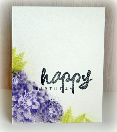
Chrissie's corner layout leaves plenty of white space which make her gorgeous blue flowers all the more vivid.

Sandra's pretty row of flowers is perfectly centred, the colours provide extra interest and the black sentiment underlines it all.
Karen's Details:

Shirley-Bee's watercolour flowers card got my attention with it's clean and crisp lines.

Lauren A. created a stunning card with lots of white space and gorgeous flowers.

Gay's card had a simplicity to it that made for such an elegant, fresh and clean card.
Susan's Details:

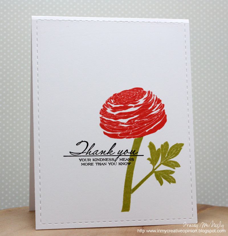
Tracey's card uses a very clean border around a very bold image with the sentiment placed absolutely perfectly in relation to the flower.

Ili Bili softened the straight lines and right angles of her card with whimsically placed flowers and the sparkle of glitter! I love the movement she created with the flowers.

Shirley-Bee paired a fun--and big--handwritten font sentiment with bold, solid flowers...and her colors simply glow off the white!

Heidi enhanced her acrylic block stamping by using a heat gun to blow the paint around and re-stamping to get this simply fabulous backdrop for her flowers, stamped in black. Great use of technique!
Cheryl's Details:
Harriet Skelly's beautiful watercolor technique (wet on wet) caught my eye with it's subtle shades of red and pink within the black outline. Great placement of the sentiment too!
Karen G's background has a wonderful movement to it. It feels like drifting clouds. Perfect for a sympathy card.
Sue created a stunning watercolor card! She used the rule of thirds, and anchored her images beautifully.


Thanks so much, Ardyth, for putting my card in the spotlight. Congratulations to everyone else that was showcased, there were countless fabulous entries for this challenge xx
ReplyDeleteWonderful selection of cards....looks easy, but in reality it can be difficult to do a one layer card!
ReplyDeleteJan
Wow, beautiful cards this week! Thanks to Karen for choosing my card! Always lots of inspiration and very interesting the details picked out by the team. Thanks to you all :D x
ReplyDeleteOh, wow! I'm truly honoured to have three cards featured from so many stunning entries! Thank you!
ReplyDeleteThank you for Highlighting my card, Cberyl! Congrats to everyone whose cards were showcased, I so enjoyed looking at all the beautiful entries. xx
ReplyDeleteThank you Cheryl for highlighting my card - I am honored to have a card featured from so many gorgeous entries!
ReplyDeleteCongratulations to all the winners! Shirley-Bee really stood out in the showcase. I've bookmarked the entire floral gallery! Hugs, Darnell
ReplyDeleteWow! Amazing cards and so much inspiration there.
ReplyDeleteCongrats to everyone showcased.
Thank you so much for the mention, Ardyth.
Caroline xxx