Friday, May 30, 2014

OLS5 - Details

What an overwhelming response to our flower challenge! So many beautiful creations from so many talented cardmakers! Join us back here on Sunday - Karen will be hosting the next challenge and you're going to love it!

Here are some of the little details from Cheryl's challenge that we loved:

Ardyth's Details:


I love how Caroline matched the font of her sentiment with the whimsical feel of her images!


Joyce's concentration of flowers in the centre of this bold fun card still leaves lots of white space!


Anita created a lovely 'nest' for her sentiment by using the rule of 3 - 3 flowers, 3 dots, 3 colours, 3 words!

Heather's Details:


Shirley-Bee's used bright splashes of colour with simple black line images to create a vibrant scene.


Chrissie's corner layout leaves plenty of white space which make her gorgeous blue flowers all the more vivid.

Sandra's pretty row of flowers is perfectly centred, the colours provide extra interest and the black sentiment underlines it all.

Karen's Details:


Shirley-Bee's watercolour flowers card got my attention with it's clean and crisp lines.


45
Lauren A. created a stunning card with lots of white space and gorgeous flowers.


Gay's card had a simplicity to it that made for such an elegant, fresh and clean card.

Susan's Details:

tracey_CCC96

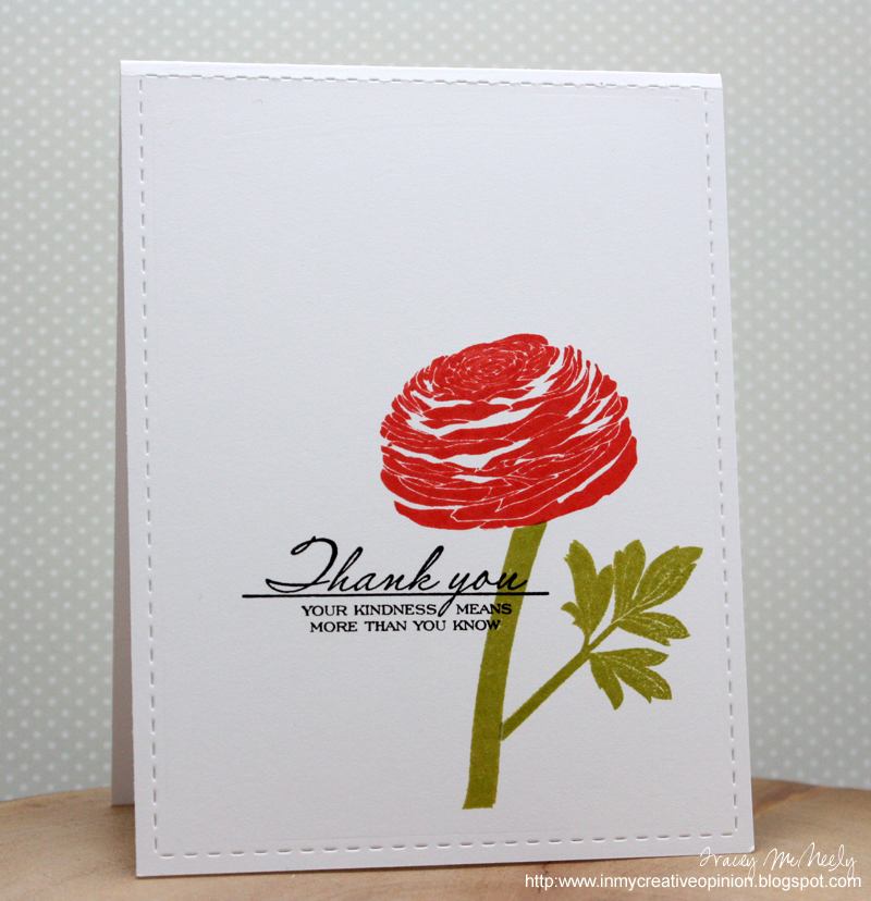
Tracey's card uses a very clean border around a very bold image with the sentiment placed absolutely perfectly in relation to the flower.


Ili Bili softened the straight lines and right angles of her card with whimsically placed flowers and the sparkle of glitter! I love the movement she created with the flowers.


Shirley-Bee paired a fun--and big--handwritten font sentiment with bold, solid flowers...and her colors simply glow off the white!


Heidi enhanced her acrylic block stamping by using a heat gun to blow the paint around and re-stamping to get this simply fabulous backdrop for her flowers, stamped in black. Great use of technique!


Cheryl's Details:


Harriet Skelly's beautiful watercolor technique (wet on wet) caught my eye with it's subtle shades of red and pink within the black outline.  Great placement of the sentiment too!


Karen G's background has a wonderful movement to it.  It feels like drifting clouds.  Perfect for a sympathy card.


Sue created a stunning watercolor card!  She used the rule of thirds, and anchored her images beautifully.   

Thursday, May 1, 2014

One-Layer Simplicity Challenge #5: Fabulous Flowers

Welcome to this month's One-Layer Simplicity Challenge!  With spring finally in the air, our challenge for May is all about flowers.

Remember the challenge will run through the 24th of the month, giving you lots of time to
play along.

 Fabulous Flowers

Make a one-layer card using floral images.  I know we all have lots of beautiful floral stamps, so dig them out and show us your flowers.

If you would like to display our blog badge on your blog, please visit the tab at the top of this page.

OLS Challenge Rules

l.  A one-layer card is defined as a single layer of cardstock folded in half.  No other layers of paper are allowed.

2.  Make a card using a floral theme.  Remember to keep embellishments to a minimum. 
3.  Post your card somewhere on the internet and link it to us using the Inlinkz button below.  If you link to your blog, please link to that specific post and not your blog's home page so we can find it easily.

4.  The most important rule of all is to have fun!


Tuesday, April 29, 2014

OLS4 - Details

Today we're posting our monthly 'details' post. This is where the DT members comment on those little details that caught our eyes and our hearts. Every month we say that we have a hard time picking out just a few, and it's true!

This month we had a lot of fun imagining where we could go and how we could get there! I love seeing how these challenge themes inspire you. You bring your talent and share your creativity with us and we truly appreciate that!

Thanks so much to everyone who participated - whether by linking up a card, or by coming by and commenting or even just by looking at all the gorgeous cards that were linked up!

Our next challenge will go live on May 1 - can't wait to see you there!


Ardyth's Details:


27 Chris F - Chris's use of watercolouring as backdrops to black line images makes this card fun and whimsical!


14 Patti - Patti's use of selective colouring makes her focal image really pop!


#3 Sherrie M - I love the way Sherrie's sentiment and focal image relate to each other and the grey oval grounds the tower perfectly!

Heather's Details:


#25 Sandra used red to great advantage on her focal image and the long sentiment doubles as a road to make a clever CAS card.

#21 Deepti used colour expertly; her sunny background makes the lovely hand drawn sailboat pop.

#35 Bev T used a simple monochrome colour scheme to create a very effective collage.


Karen's Details:


#2- Ingrid- Love her beach scene and how she sponged the block and blended the beachy colours         together so well.


#24- Jasleen- Great one-layer with lots of interest and details.


ETA - Oops - this post went up without Susan's details - here they are!


#12 Lynn’s crisp and clean play on a New York minute stole my heart with its kind sentiment and yellow taxi.


#33 Yvette made her card shape fit her design for this absolutely adorable House Mouse trekking his way toward happiness in lime green shoes.


Tuesday, April 1, 2014

One-layer SImplicity Challenge #4: Road Trip!

Welcome to our fourth challenge at One-Layer Simplicity!

We are so thrilled with your response to OLS - we know you love to have all the challenges in one place here on our new blog.  The challenges will appear on the 1st and run until the 24th, giving you lots of time to play along.  This month we're going to take a

ROAD TRIP


Make a travel-themed one-layer card.

It can be destination-based (ie a favourite or dreamed-of vacation spot) or journey-based (the transportation you used to get there).

If you would like to display our blog badge on your blog please visit the tab at the top of this page.


OLS Challenge Rules

l.  A one -layer card is defined as a single layer of cardstock folded in half.  No other layers of paper are allowed.

2.  Make a card using travel-themed images and/or sentiments.  Remember to keep embellishments to a minimum. 

3.  Post your card somewhere on the internet and link it to us using the Inlinkz button below.  If you link to your blog, please link to that specific post and not your blog's home page so we can find it easily.

4.  The most important rule of all is to have fun!

Friday, March 28, 2014

OLS3 - Details

Well, it has been another great month of wonderfully inspiring cards posted here at OLS.  Every month, our design team spotlights cards that demonstrate those little details that really make one-layer cards work.  One-layer can be difficult for many but we hope that by looking at the designs of other card makers it will give inspiration and encourage you to give it a try.  It may just give you a new perspective or some helpful hints that you can use to make a really eye catching design.

The design team is asked to feature 3-4 cards but honestly, that is a difficult task considering all the awesome entries.  Thanks so much to all that played along and I hope you had fun 'adding water' to your one-layer designs.

We hope you enjoyed the One-Layer Simplicity Challenge for March and that you are looking forward to April's challenge hosted by Ardyth Percy-Robb.

Karen's Details

Audrie's  card was just wonderfully done with the ink mixed with water just flowed onto her embossed areas.

amuse studio rubber stamps
Chris's card is wonderfully done with a water-coloured background for the silhouette images.


Vicky's card had a softness and the lovely feel of a country garden which she created using her acrylic block and scribbles.


Sandra's card caught my eye with it's wonderful colour, interest and depth she created using inks and water to blend.


Ardyth's Details


#52 Leslie's minimal but vibrant pops of colour add a fun, whimsical touch to a serious sentiment!


#10  Linda's blending of two fresh spring colours is breathtaking - and I love that she left lots of breathing room!


#64 Darnell's layering of coloured (and watered) stamping,embossing and shimmer is an amazing effect - sparkly, colourful and full of interest!


Heather's Details


Kailash has used pretty spring colours, softened with water to create her own gorgeous floral pattern.

amuse studio rubber stamps
Chris F vibrant splash of colour is balanced by a large sentiment and border to link the whole layout.

Lyn's free and abstract watercolour background gives the delightful impression of a forest.

Susan's Details


Cornelia used water to create this dreamy, soothing card in gray and blue...so unified and harmonious with the message.


Janet turned a "mistake" into a lovely card with pen lines and pearls, and her "correct" versions of the card are equally lovely!


Sunny used a lovely right-angle design and overlapping with perfect placement to make her simple and fresh card catch my eye.


I love that Bonnie made a Christmas card in March...and the embossed lines and vivid colors make it stand out!

Saturday, March 1, 2014

One-Layer Simplicity #3 - Just Add Water


Welcome to another month at One-Layer Simplicity.  Are you ready for another fun challenge??!!  
We are thrilled to have all the challenges in one place now on our new blog.  The challenges will appear on the 1st and run until the 24th, giving you lots of time to play along.  So get out your water sprayers or your water brush and get ready to


JUST ADD WATER

You all know how much I love spraying my stamps with water before pressing them onto my paper.  It gives such a wonderful watercolour look to the images and if you use water-based inks, they blend together so nicely. 
You can check out all the guidelines for the making of a one layer card on the tab at the top of the blog page.
If you would like to display our blog badge on your blog please visit the tab at the top of this page.


OLS Challenge Rules

l.  A one -layer card is defined as a single layer of cardstock folded in half.  No other layers of paper are allowed.

2.  Make a card that uses water sprayed or applied onto an image or create a background using water to blend.  Remember to keep embellishments to a minimum. 

3.  Post your card somewhere on the internet and link it to us using the Inlinkz button below.  If you link to your blog, please link to that specific post and not your blog's home page so we can find it easily.

4.  The most important rule of all is to have fun and add water to your colour image or spray away this month.


Thursday, February 27, 2014

OLS2 - Details

If you joined us last month you will know that our design team spotlights cards that demonstrate those little details of design that make one-layer cards stand out. Looking at the designs of other card makers can give us all the inspiration to try something new on our one layer cards and give us the helpful hints we might need to make a really eye catching design.

Once again it was very hard to limit ourselves to just a few details. There were so many imaginative ways to use repetition on a card.

We hope you enjoyed our February One-Layer Simplicity challenge and that you are looking forward to March's challenge hosted by Karen Dunbrook.

Heather's Details


#71 Joyce M What can I say? Tilting the dress forms was a stroke of genius; it creates movement and the overlaps add a few more tones to the lovely colours chosen.

#81 Patti shows us how to make the sentiment an integral part of a simple design.

WPlus9 Bday 3, PTI MIM 152, LT 31, OLS 2
#103 Anita's positioning of the sentiment is beautifully done. The masking and placement show her attention to detail and balance.

Karen's Details

So many wonderful cards again this month in the gallery.  Here are 3 that I really liked:


#3 Toni's card was such a great example of colour variations and using a stencil over a stencil.


#10 Sue's watercolour flowers were wonderful and airy just like a watercolour picture.


#83 Mynn's hexagon card had such great detail and wonderful balance and colours.

Ardyth's Details

13
#85 - Lauren's choice of colours and simple shapes made this simple card stand out to me.


#79 - Gay's beautifully elegant card shows that using classic black and white is always stylish!

by karen @ carefree creations - New House

#90 - Karen's choice to use colour for her line images really reinforces her message.


Susan's Details


#23 Michelle W uses bling to create movement for the eye in an otherwise static graphic design


#45 Gillian R went super-clean with her design...but the chevron hearts pack an unexpected design punch


#52 Shirley-Bee used distressing so very well to soften her lovely trio of flowers