Friday, November 28, 2014

OLS11 - Details

It's time for our Details post for the One-Layer Simplicity Challenge #11: Home, Sweet Home! It's tough for us to pick just a few cards, and the collection this time was particularly impressive!

For those who are new to OLS, each month on the 28th, the design team calls out our favorite details from the month's entries. We focus on those little touches that take clean-and-simple one-layer cards from good to great! We hope these posts inspire you and encourage you to do more with just one layer!

Please note that the OLS takes a break in December, allowing us all to focus on family and friends and the holidays. We will resume on January 1, 2015. In the meantime, have a very Merry Christmas/Happy Hanukkah/Happy Holidays!

Susan's Details

One Layer Simplicity Challenge

Ashwini created a stunner with her fabulous green-spectrum background, but it's that delightfully dimensional and glittery heart that draws the eye and makes that focal point work so very, very well.


Toni used gold embossing perfectly, creating a straight strip across the top of the card that balances the curvy elegance of the stamp...which is both beautiful and meaningful! The finishing touch that makes the card really pop is the red heart-shaped rhinestone in the center. PERFECT!


Angela created a lovely, home-y scene in perfect colors to pop right off the crisp, white background. Her use of glitter to accent the house and trees is spot-on, and that darling wreath is handled perfectly!

Heather's Details


Julie's use of white space as a continuation of her snow covered landscape is a technique which works beautifully on a one layer card. Her deep blue sky just makes the scene all the more striking.


Cornelia used the same technique as Julie but with a very different look. The snowy foreground white space goes on forever contrasting with the bright house cosily tucked in amongst the trees.


Although Helen's cool stamp covers the entire card front the monochromatic colour scheme keeps the card simple and effective

Ardyth's Details:


Joyce's use of a traditional colour scheme, solid images and white space make this card look modern and classic at the same time!


Karin's 'home with a twist' made me laugh out loud! I love how the scoring looks like a baseboard - exactly where you might find a mouse-hole!


Karen's Details:


Anita created a wonderfully done holiday card.  Love the way she layered the scene with inks.


Vicki's card got my attention right away with it's beautifully done night sky and hint of lights in the background.

Thanks to all who participated in this last OLS challenge of 2014. We'll see you on January 1, 2015, ready for another year of simple, clean, and one layer!!!!

Saturday, November 1, 2014

One-Layer Simplicity #11: Home, Sweet Home

Our November challenge is to make a card with some reference to Home, Sweet Home! The card can be any theme, from the obvious welcome home to congratulations on your new home or even welcome to the neighborhood or thanks for your hospitality. OR you may use an image of a house/home and make the card any theme you want...birthday, Christmas, Thanksgiving, thank you, whatever.

During a time of year when we invest so much in decorating our homes and inviting people to them (or going to other people's homes), it seems appropriate to focus on home, sweet home!

Here's my card, a Christmas card with a wonderful, homey sentiment.

stamps by Hero Arts (house) and Papertrey (sentiment)

Rules for Home, Sweet Home:

1. A one-layer card is defined as a single piece of card stock folded in half. No other layers allowed.

2. Make a card with some reference to home...either in theme or in image.

3. Post your card somewhere online and link to it using the InLinkz button on this post. If you link to your blog, make sure you link to the specific post and not your home page so we can find it easily later.

4. Post before midnight on November 24, 2014. That's when the InLinkz button will close.

5. The most important rule of all is to HAVE FUN!


Wednesday, October 29, 2014

OLS10 - Details


Thank you to all how joined us this month for our "Turning to Fall" challenge.  We saw all the vibrant colors (or colours) of  the season, along with wonderful designs.  It's always so hard to choose just a few!

Please join us on Saturday, November 1st for our next challenge.


Cheryl's Details:


Anita's water droplet immediately caught my eye.  It's so realistic looking. I also loved her use of colored pencils and beautiful blending.
Shirley's water coloring is amazing, and I loved the placement of her sentiment and fun spatter!


Sandra's  sentiment is perfect for the season, along with her series of three images stamped in rich fall colors.

Heather's Details:


Violet's burst of watercolour and the elegant font in her sentiment combine to make a stunning card.


Margaret's tiled layout is beautifully balanced but keeps the eye moving over the pretty leaf patterns in her panel.


Vicki's vibrant colour, bold embossing and touching sentiment tell a story in one single layer.


Ardyth's Details:


Rema's simple classic layout still packs a lot of punch due to her multi-colour leaves!


Karin's card practically glows with warmth! Her technique of masking, sponging and stamping is gorgeous!


Joanne's use of tiny stamps creates a scene full of movement and interest!


Karen's Details:


Helen's card is just so wonderfully done with lots of white space and multicoloured leaves.


2014-10-16 OLC Hello TO reminder
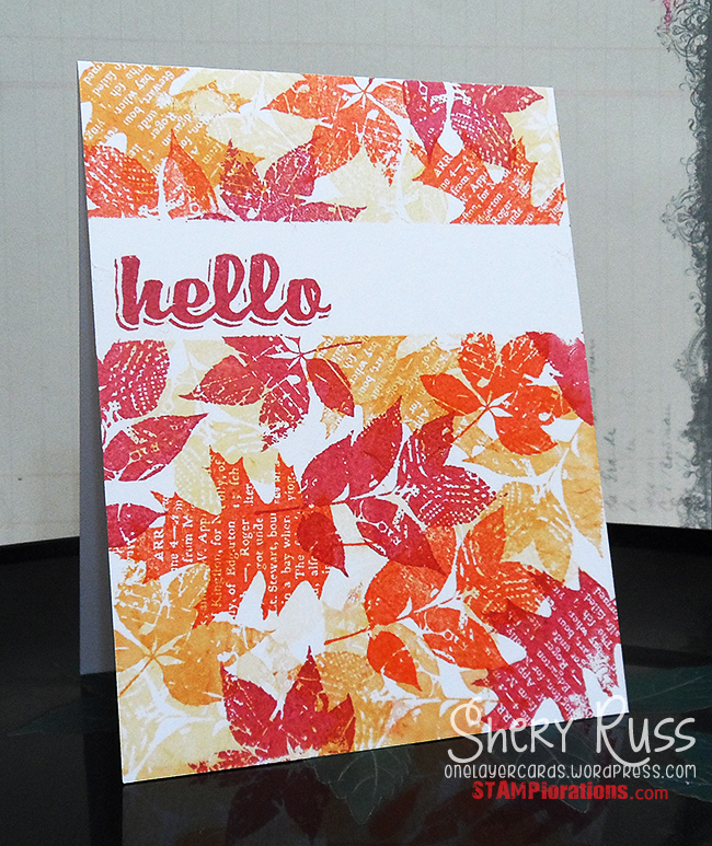
Shery's card is a flurry of vibrant and lovely leaves. 


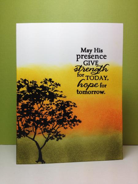
Maura sponged some great fall colours on her card that offers encouragement.  Love the warmth of it.

Wednesday, October 1, 2014

One-Layer Simplicity Challenge #10: Turning to Fall

Welcome to this month's One-Layer Simplicity Challenge.  Thanks for joining us. This month, we're Turning to Fall! 

Fall has arrived with all its glory.  We can feel it in the cooler temperatures, and we can see it in the bursts of color starting to appear.  So, with the season's inspiration all around us make a one-layer card with fall in mind. 
 

For my card, I was trying to achieve the "falling leaf" effect.  I used a Papertrey Ink image and sentiment, along with Gorgeous Grunge (Stampin'Up) for the spatter background. 


Turning to Fall (Rules for OLS10)
  1. A one-layer card is defined as a single layer of cardstock folded in half.  No other layers of paper are allowed.
  2. Make a one-layer card using fall as your inspiration. Remember to keep embellishments to a minimum. 
  3. Post your card somewhere on the internet and link it to us using the Inlinkz button below.  If you link to your blog, please link to that specific post and not your blog's home page so we can find it easily.
  4. Link up before midnight on October 24.
  5. The most important rule of all is to have fun!


Sunday, September 28, 2014

OLS9 - Details

Wow! What an amazing assortment of styles we saw this month - from graphic to collage, to classic to abstract! It really shows that all you need is paper and ink to make incredible cards! Thanks so much for sharing your talent and creativity this month!

Here are some of the details that we loved this month:

Ardyth's Details:


Karen's use of sponging with different colours of ink creates a gorgeous background for her snowflake!


Jasleen's brightly-coloured squares create an a-MAZE-ing optical illusion!


Julene's use of two rectangles to form a square is really inventive!


Karen's Details


 Kimberly's gorgeous image stamped in those colours is so warm and welcoming.


 Maura's gorgeous card for Autumn is just stunning with the motion of the leaves and the fabulous colours.


Sherrie M. used squares to create a great set of all occasion cards, would make a great gift.


Heather's Details


Janine B used white on kraft which is a wonderful colour combination especially with the bright pops of blue and red.


Kobylkin used rich warm colours and a four part collage to create a beautiful square. Combining three leaves with an intricate circle pattern is unusual and effective.


Janet's partial square and overlapping butterfly lead the eye on towards the sentiment.


Cheryl's Details:


Tonya's use of a two color background brought life to her tranquil seascape.


Caroline's frame of candles caught my eye.  So fun and playful!


Chriss's card has a wonderful botanical feel and pleasing color palette.


Monday, September 1, 2014

One-Layer Simplicity Challenge #9: Hip to be Square


Ardyth here, your hostess for OLS9. This month, it's hip to be square! Make a one-layer card  incorporating a square in some way. I love to make 4 1/4x 4 1/4 inch square cards - they feel modern and symmetrical PLUS they fit into a standard envelope and don't require extra postage. You can choose to use your squares in other creative ways - as long as there's a square on your card somehow, somewhere, you're hip!

For this square card, I chose a square Papertrey stamp and stamped it 4 times in bold colours, creating another square. I chose a bold, thick Technique Tuesday sentiment stamped in black, to ensure that it was easy to read. The brightly-coloured square grounds the sentiment, but doesn't overwhelm it.


How to be Hip! (Rules for OLS9)
  1. A one-layer card is defined as a single layer of cardstock folded in half.  No other layers of paper are allowed.
  2. Make a one-layer card using a square in some way. Remember to keep embellishments to a minimum. 
  3. Post your card somewhere on the internet and link it to us using the Inlinkz button below.  If you link to your blog, please link to that specific post and not your blog's home page so we can find it easily.
  4. Link up before midnight on September 24.
  5. The most important rule of all is to have fun!


Thursday, August 28, 2014

OLS8 - Details

Welcome to the Details Post for OLS#8. As we do each month, a few design team members will call out selected details from entries for the month as particularly effective design elements. One-layer cards have little room for embellishment or dressing up, and it's often amazing how a simple little detail will elevate a CAS card to something amazing!

Thank you all for participating in the August One-Layer Simplicity Challenge: Shades of Summer! What a great collection of cards we got, and it has been so difficult to pick just three whose details elevate their designs especially well.

Susan's Details


Kimberly used fabulous, summery colors from the #5 inspiration photo, but what I really love is the use of a bold, black sentiment and subtle half pearls.


Shirley used a gorgeous no-line watercolor technique to achieve the effect of a hand-painted rather than stamped-and-painted butterfly using the colors from the #5 inspiration photo.


Jasleen exploited the blue and orange combination from the #3 photo. Her one-corner, fade background is simply stunning.


Ardyth's Details

Sherrie's use of background stamps to make a sunny beach scene is inspired!

Distress Arrow Sentiment-1
Julia's beautifully blended and framed card evokes summer perfectly!


amuse studio rubber stamps
Chris's use of line images leaves this CAS card feeling very light and airy!


Karen's Details


 Katherine's card caught my eye with it's fun lineup of glasses and the paint splatters. 
 
 
Sandra's card had such a tranquil, calm beauty to it done in the colours of Fall.
 
 
 Sue T's card really makes such a pretty statement with its banner greeting and the cascading flowers.


Cheryl's Details


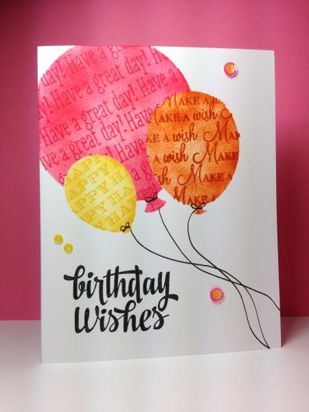
Maura used such bright happy colors for her card.  I love how she masked and stamped on her balloons for added interest.


Lynn's soft outline around her images caught my eye.  The perfect masculine card.


Darnell's technique (colored stamp with markers, then lightly misted with water) resulted in a beautiful watercolor effect, with a soft subtle feel.


Thank you all so much for participating in the August challenge. Now, get ready for Ardyth's September challenge!!!